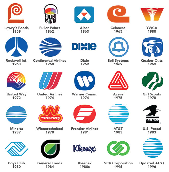
To start, I don’t consider myself to be all that nostalgic. Maybe growing up in the Reagan-era 1980s had something to do with that. While I’m sure I’d get an argument from the younger members of the office, I don't feel much came out of the 1980s to be nostalgic about. The Cold War. Rampant conservatism. Atrocious music. This.
Advertising was on the verge of the personal computer revolution and felt cold and sterile. So I have to go even farther back to the work of graphic designer Saul Bass in order to find something that makes me long for an earlier time.
Branding the 1970s
While the height of Saul’s corporate branding work was the late 1960s through to the early 1980s, you can still see the roots of his work today in logo designs for brands like Kleenex, Girl Scouts of America and AT&T.
His logos epitomize the 1970s:

When you see the logos for Continental Airlines, United Way or Warner Communications, nostalgia just pours from them like you’re being pulled back in time. Yet even though most of Saul’s logos have been replaced or heavily updated, a handful have stood the test of time and corporate turnover.
The Avery logo of 1975, for example, is amazingly untouched. And the Wienerschnitzel logo, while having a minor update in 2009, still has the feel and energy that Saul imparted back in 1978. The brand still uses the bright, '70s-era color scheme from the original logo, which I would say is an intentional nod at nostalgia from the current advertising firm—can’t you just imagine eating a Wienerschnitzel hot dog in this?
"Imitation is the Sincerest Form of Flattery"
I believe even in this day that Saul’s technique of visually simple, yet strong logo designs are what separate average logos from truly successful and identifiable brands. But Saul didn’t just work to build corporate identities. His work designing movie posters and title sequences in the '50s and '60s is just as—if not more—influential on summing up the visual identity of an era than his logos of the '70s.
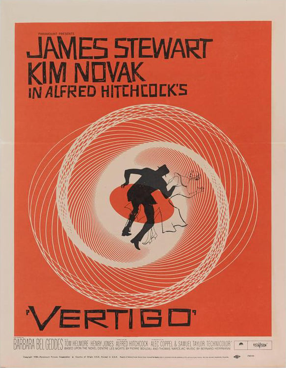
Movie posters for “Anatomy of a Murder” and “Vertigo” are iconic. His style of strong, solid blocks of color with a simple, striking illustration and hand-crafted typography exude the late '50s and still influences many graphic designers.

Saul Bass' now iconic poster for Hitchcock's Vertigo, designed in 1958.
-1.jpg?width=498&name=Saul_Nostalgia_Murder%20(1)-1.jpg)
Anatomy of a Murder poster, designed a year later in 1959.
I think I can safely use the Oscar Wilde quote here, “Imitation is the sincerest form of flattery.” Do a Google image search on “Saul Bass style” and you’ll find that the hipster designers of today have copied Saul’s style to create posters for just about any movie or TV show you can think of.
Again, his work graphically encapsulates an age. How many graphic designers can say their work visually sums up nostalgia in not just one era, but two?

Chris Moore grew up in a time when there were only four TV channels and you had to get off the couch to change them. He still believes the theme music to "Barney Miller" is the best TV intro of all time, and has masking tape on the floor around his desk to indicate the boundaries of his "office" a la Les Nessman from WKRP. He is NOT nostalgic about going to high school in the Reagan era, but will gladly reminisce about Night Flight with anyone who also remembers.


Submit a Comment