


Kelly Stapella
As the Communications Manager for de Novo, Kelly lends her strengths as a writer and researcher to help the team create award winning content and strategies that help our clients meet their goals.
No brand is a static entity.
As a business naturally evolves, its people, capabilities and culture change with it. Marketing materials will have to change too—this is a given. But websites, collateral and social media graphics aren’t the only things that need to keep up. Sometimes the brand itself needs a little bit of tweaking.
Since de Novo was founded in 2007, we’ve made gradual, strategic adjustments to how we represent ourselves through graphics and messaging. But given that we headed into a new decade this year, the timing was right to make an even bigger change.Of course, there was nothing spontaneous about our decision to update our fonts, expand our color palate and go all-in on a new theme for 2020. We already had a well-established brand and personality that we loved—starting from scratch with a total rebrand would have been counterproductive. So how did we go about refreshing our image without throwing away what makes us, well, us?
It took a bit of introspection and a hell of a lot of collaboration. The process felt sluggish at times, but we took our time. And on the way, we gave our team the opportunity to coordinate, calibrate and get on the same page. As a result, we not only have a stronger brand, but a stronger team and a stronger vision.
Here's a breakdown of the biggest changes we made to the de Novo brand, and the why behind our creative decisions:
A New Theme
To give everything a sense of cohesion, we decided to pick an underlying theme that could act as the basis for our refresh—our starting off point. We selected “Into the Woods” for three specific reasons:
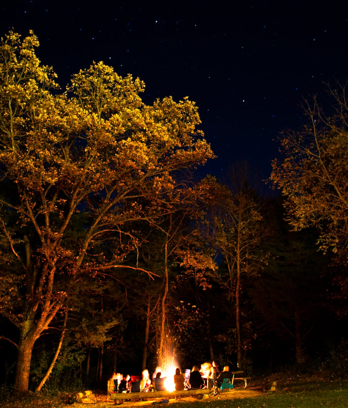
1 ) Every year, we hold an annual team retreat in a cabin in the woods where we get to explore, reflect on our work and assess how we’d fare in a zombie apocalypse. The experience brings us closer together and helps affirm what matters to us as people—not just as a company. Over the years, the retreat has come to embody our earnestness, openness and collaborative strength.
When thinking about potential themes, we kept coming back to that cabin in the woods.
2) If de Novians share one trait, it’s our sense of adventure. We’re a curious bunch, and we’re not afraid to jump down any rabbit holes we stumble upon. Into the Woods reflects our desire to keep learning and a resourcefulness that has helped us succeed in the face of uncertainty. It’s our spirit come to life.
3) Community development is the heart of what we do. Sometimes that means working directly with cities, nonprofits or CVBs to promote a specific location. Other times it means helping a commercial brand succeed so they can pay it back to the community that made their success possible.
We strongly believe that a community’s natural resources should be a source of pride—and a major selling point. Iowa is rich with natural beauty. We love our trails, nature reserves and waterways, and we’re glad to say that slowly but surely, the rest of the world is catching on to how great they are. It seemed fitting that our new theme not only reflect the direction we wanted to take, but the direction the rest of the world was heading too.
Color Palette Updates
PMS 193 (de Novo Red) is bold. It’s daring. It’s alive. And for the last 12 years, it’s been pretty much the only color we've use for our own marketing efforts.
While we have no plans of ditching the red—ever—it was time to add more depth to our color palette. Keeping in mind our new theme, we selected colors that complimented the red while simultaneously bringing to mind the outdoors: a fiery yellow the reminds us of the glow around a campfire, and a foamy teal that brings to mind the gravelly, moss-covered banks of the Iowa River.
We then set our colors in stone by updating our Brand Standards:

(Unfamiliar with that term? Read our design team’s definitive guide to Brand Standards.)
 "Expanding a brand is always a fun challenge. Here, we've added another dimension to our brand/personality. Since de Novo was founded, we've limited ourselves in the colors we've used. Limits can be good. But we saw this as an opportunity to create a contemporary color palette that brings punches of color to our visual vernacular. The draw of camping is eschewing the bonds of our warm and protective abode for the freedom of the night sky. We've done the same with our color palette updates by breaking out from tradition for some creative freedom."
Graphic Updates
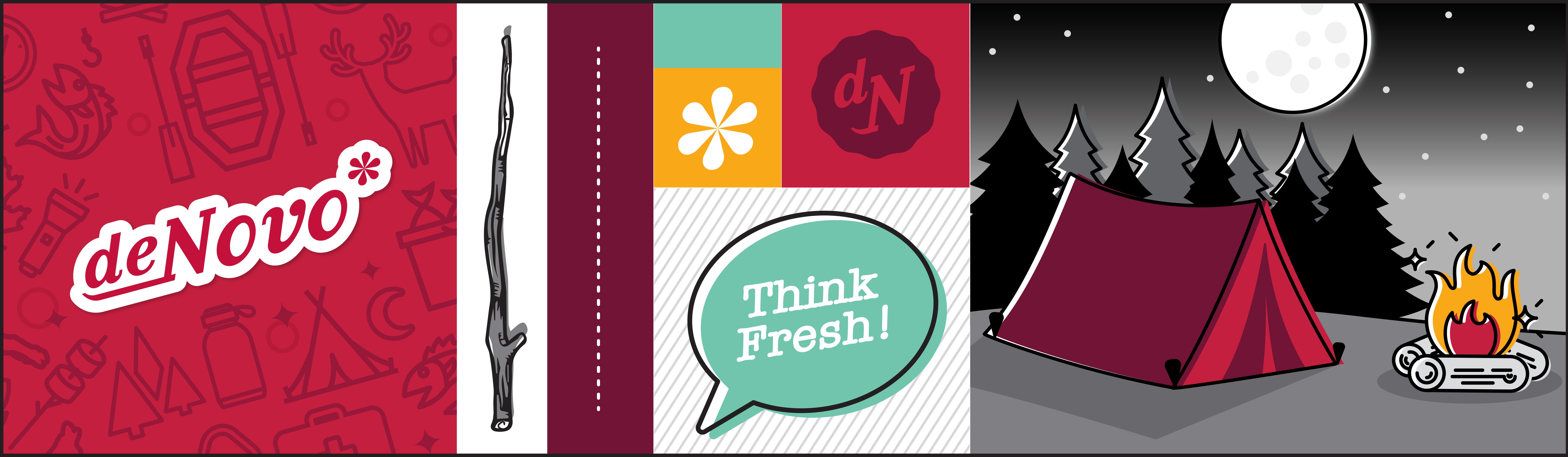
With our new colors in place, we got to work refreshing the graphics and icons we use throughout our marketing materials, and in particular, our newsletter:
 “Combining a refreshed color palette, an extended library of iconography and a dynamic new header, my goal was to infuse energy and freshness into our monthly newsletter design. I purposely kept the layout clean and simple, giving us the flexibility and ease to update and add more visual content as the year progresses.
Playful touches (including the tree branch dividers and wood grain texture) are incorporated within the design, but our core de Novo branding still shines through. These nature-inspired graphics reflect our newly developed camping theme, a reminder of the inspiration and rejuvenation gained during our annual team retreat.”
 "As the visual elements were coming together, I turned my attention to our newsletter—the first item to get the refresh treatment. I wanted the theme to shine through without overpowering the substance of the content it featured, so I focused on making cheeky—but relevant— adjustments to section header copy. Featured blogs became “Roadmaps & Field Guides,” and our snarky little industry news section became “Hot Takes & Tall Tales.” Finally, the newsletter name was updated to "Sparking Fresh Ideas," a play off the new header animation."
Speaking of that header animation…
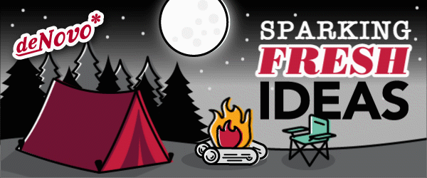
 “Our new animated header was designed to reflect the fun new theme de Novo has chosen for 2020. The outdoor/camping motif allows us to incorporate elements of our new color palette and add some visual excitement, while the animation of the campfire is the perfect connection to our newsletter’s name, 'Sparking Fresh Ideas.'
The header was designed with distinct elements that are meant to be flexible, so we plan to update and rotate the animation throughout the year. There are opportunities to play with the trees, stars, the tent and chair, and even the text. Simple and subtle changes like this will keep things fresh as we embrace this new look and feel over the long-term.”
A New Team Photo
Technically, the new team photo is what started it all. We concepted extensively prior to our last team retreat to stage an elaborate new photo that would capture our personalities and culture. Since we had limited time to set the scene, get everyone in place and snag the right shot before the sun started working against us, we spent a lot of time planning things back in the office.
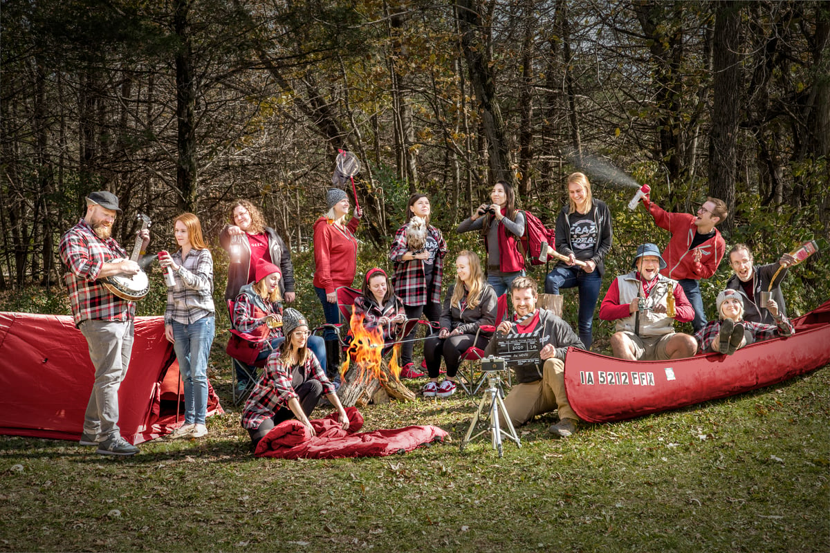
 “The refresh for me really was the last 'Welcome to the de Novo family' gesture. To get specific, when I started at de Novo, it’d been a few years since the last team photo was taken. A few of those team members had moved on, and new ones (like me) had joined the team. And while it was still visually interesting, it needed an update.
When Jen approached me with the idea of taking a new team photo, I was both excited and hesitant. The team is very close with one another, and capturing our culture—our uniqueness—in a single shot was important, but daunting. Luckily the team behind de Novo is very supportive and willing to help wherever they can. We had a blast bouncing ideas off one another, finding the right props and getting into our poses. I’m proud to have taken the team photo, but even prouder to be in it!"
Bringing It All Together
With all of the new branding elements in place, the only thing left was to put them to work. We've already started using the new colors in social media posts and are planning on launching the refreshed newsletter template next week. (Sign up for our mailing list so you don't miss it!) We're also waiting for the perfect opportunity to apply the new branding to our next team video.
Curious to see what else we've got in store? Follow us on Facebook and Instagram. Wanna talk about refreshing your brand? Get in touch and follow us into the woods!


Submit a Comment