


Rebecca Skalsky

What comes to mind when you hear the words “graphic design”?
Making things pretty for a living? Computer wizardry? A coffee-drinking, flannel-clad, Apple-product aficionado?
While there may be some truth to these stereotypes—I confess, I’m a creative who loves coffee and Apple tech—graphic design is officially defined as a form of visual communication using color, typography and imagery to convey ideas that inspire and inform consumers.
Just look around you. The billboard you drive past each morning… The sponsored ad in your Instagram feed… The label on your favorite beverage…. We’re literally surrounded by graphic design. Yet as common as it is in our everyday lives, the industry comes with its own share of misconceptions.
Whether you currently work with an agency/graphic designer or you’re considering a future partnership with one, a clear understanding of myth vs. reality in this field will help set expectations, ensure a great working relationship, and improve efficiency throughout the creative process.
So without further ado, let’s look at seven of the most common myths associated with graphic design:
1. GRAPHIC DESIGN IS ALL ABOUT MAKING THINGS LOOK PRETTY.
Sure, this is a result of great design, but not the goal. Like any creative medium, graphic design is subjective—what you consider “pretty” could elicit a completely different response from someone else. Because of this, the research phase of a project is crucial to drive aesthetic choices, evoke a certain reaction from the target audience, and prompt them to take a specific action.
From typography and color palette to shapes and photography style—each element is motivated by a designer’s inherent knowledge of design principles. This includes color theory, visual hierarchy, white space and balance, which, when combined, tell your brand’s story and bring clarity to your message.
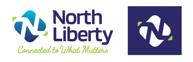 When de Novo created the logo for the city of North Liberty, we designed it to be modern, warm and reflective of the pride residents have for the community. The “N” and “L” are connected in the center of the logo mark to symbolize the idea of a close-knit atmosphere, while the forward slant adds energy and gives a nod to North Liberty being a forward-thinking city. There’s also a directional feeling to the icon, reminiscent of a compass to represent an ideal location close to other communities and opportunities. Within the color palette, blue is tied to the loyalty that residents have, while green highlights the area’s continuing growth.
2. GRAPHIC DESIGN IS SOLELY A COMPUTER-BASED PROCESS.
It’s true that a majority of graphic design work is done on a computer—but never underestimate the value of a sketchbook. There’s something so natural about the feeling of pen and pencil on paper that can’t be replicated by a digital medium. Ideas just seem to flow more freely!Sketchbooks are especially useful in the early stages of a project, whether concepting for a brand or developing a rough storyboard for animation. Hand-lettering and illustration also remain popular design mediums, with early iterations often beginning with pencil and paper.

Initial concept sketches for the Catherine McAuley Center logo. Starting out with a sketch book is an effective way to get ideas flowing when developing graphics for a brand. From there, ideas can be further refined and eventually digitized via computer.
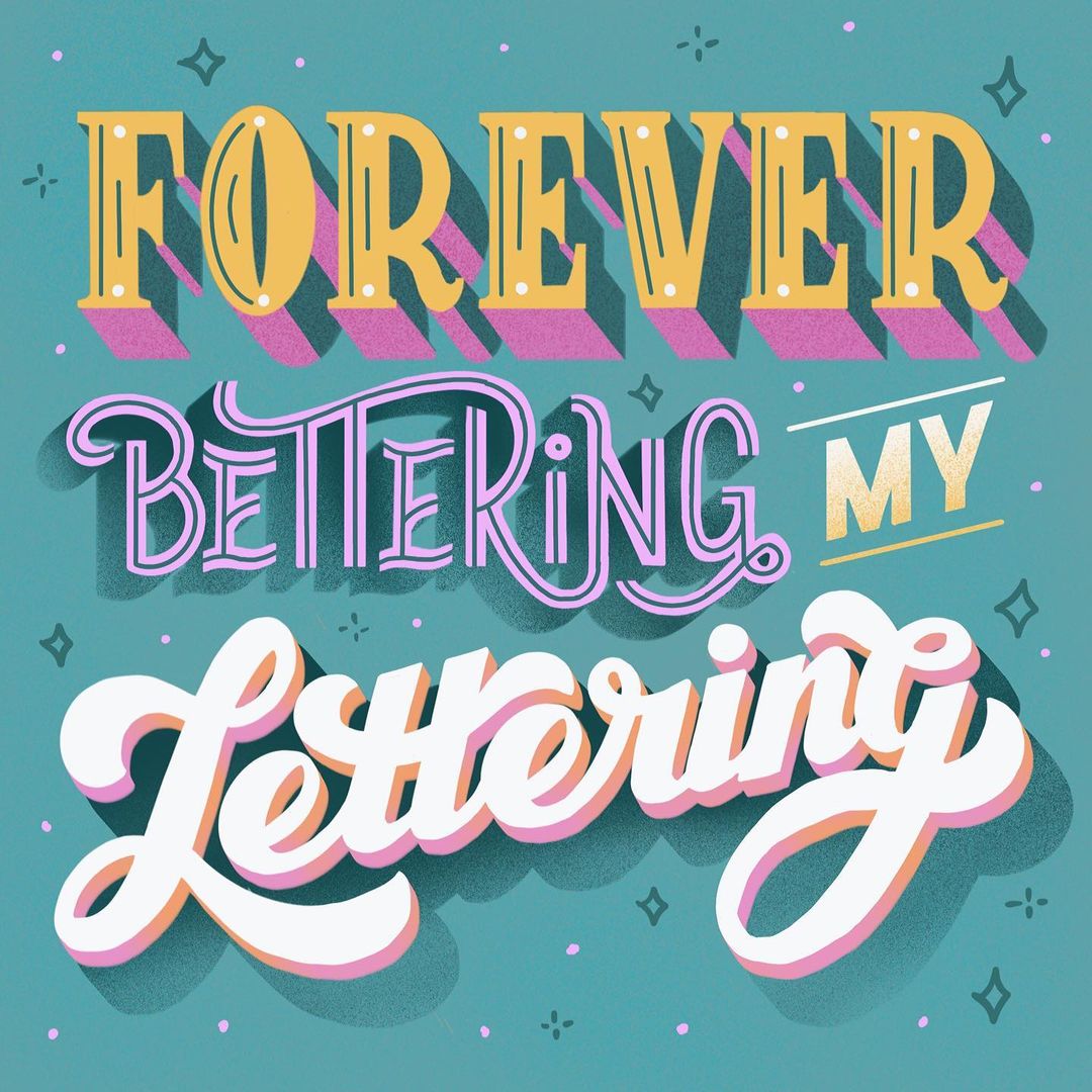
The introduction of mobile tools—such as the iPad Pro and Apple Pencil, along with mobile design applications—allows designers to create on-the-go, wherever creativity strikes. Drawing on an iPad mimics the feeling of pencil/pen and paper in many ways, making it ideal for developing hand lettered graphics, such as this.
3. GRAPHIC DESIGN IS A ONE-WAY STREET.
Not the case whatsoever! de Novo often talks about our Collective Creative, which refers to our team’s combined creativity and expertise that we apply to everything we do. Designers and clients should actively seek to embody this collaborative spirit as partners.
Just as clients look to designers for their visual knowledge and guidance, designers rely on the insight and background clients provide about their business. This informs decisions about how best to craft a logo, design a brochure, create a social media graphic, and more to meet their goals. The best creative work is built on a solid foundation of trust and open communication where both clients and designers feel equally vested in the partnership.
4. ANYONE CAN BE A GRAPHIC DESIGNER.
Eh, not so much. While most design programs are readily accessible and free alternatives exist, at the end of the day these are just tools. And like any tool, they require a certain level of ability and experience to use them successfully.
The sheer abundance of software coupled with the numerous features in each program make the possibilities pretty much limitless—if you can’t navigate your way through these programs, you won’t get far. Not to mention, technology is constantly advancing. New design trends emerge every year. You have to be fully committed to ongoing education in order to hone the craft. Simply put, graphic design can’t be learned in a one-and-done training session.
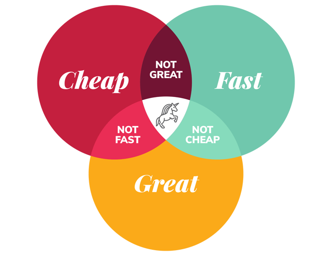
5. GRAPHIC DESIGN SHOULD BE CHEAP.
You know that old expression, “you get what you pay for”? Well, in most cases it applies to graphic design too. Does cheap design exist? Absolutely. But this doesn’t usually equal stellar results.
Think of it like this: would you expect to get the same comfort, support, longevity and value from a $20 pair of athletic shoes vs. a pair that costs $200? Probably not. When assessing the value of a logo, social media graphic, billboard design or whatever the project happens to be, it’s important to look beyond the final deliverable(s) and acknowledge the time, research, knowledge and skill that feeds into the creative process.
Think back to the idea of graphic design being a two-way street. Open and honest communication goes a long way in making sure everyone is on the same page and that they know what to expect when it comes to budget and timelines.
6. GRAPHIC DESIGN IS EASY.
You might look at a logo like the iconic Nike swoosh and deduce from its simplicity that it was “easy” to produce. Unfortunately, this doesn’t account for the time and effort that goes into the strategy, research, planning and actual creation, or the specific demands that come with the graphic design profession.With looming deadlines and tight turnarounds, designers have to be organized and able to juggle multiple projects at once. Then there’s the need to constantly be on your creative game, which can lead to burnout if designers don’t take time to adequately rest and recharge.
Long hours pretty much come with the territory of any creative profession and graphic design is no exception. It’s difficult to predict how and where creativity will strike, so designers may find themselves spending extra time on a challenging project until they reach that “Eureka!” moment.
7. GRAPHIC DESIGN IS ONLY ABOUT CREATING LOGOS.
Yes, designing logos is an integral aspect of graphic design. But it’s only one small subset of the industry. Plus, the approach to developing logos has also evolved for the digital world, incorporating things like animation and taking responsive design into account.
Similarly, there’s a misconception that graphic design applies only to print materials like business cards, inserts and brochures. But with the world’s ever-growing virtual presence, digital design continues to soar. Consequently, designing website mock-ups, digital ads (including those with animation) and supporting graphics for video remains commonplace in the workloads of most designers.

It's crucial for logos to adapt to their environment, whether used at a large scale on a billboard or as an avatar on your social media page. A responsive logo includes several variations, often simplified down to just the icon (aka logo mark). In the case of the Downtown Cedar Rapids logo, it was designed to work in both horizontal and vertical formats. In its most basic form (as seen in the far right version), the horizontal line and the words "Cedar Rapids" were removed, allowing the logo to still be visible at a smaller size and maintaining the most critical parts of the logo for brand recognition.
Digital ads have become a normal part of many designers' workloads as content continues to be consumed via the web, email and social media. With an influx of content at our fingertips, it's important for companies and organizations to stand out in order to capture the attention of consumers. The use of animation within digital media not only adds movement and interest, but also gives each company an opportunity to tell the story of their brand.
Want more insights, tips, and tricks? Download our graphic design cheat sheet, which covers some of the most widely used terminology in the industry.

Still curious about graphic design? Stay in the creative mindset with these design-related reads:
- 12 Logos in 12 Months: Reflections on a Year in Branding
- 7 Tips for Giving Your Graphic Designer Better Feedback
- Q & A: Keeping Tabs on Your Brand Identity with Chris & Becca

Submit a Comment