


Design Team
1 year. 3 designers. 12 logos.
YEP, WE HAD A PRETTY BUSY 2020.
From branding new businesses to helping established companies expand and refresh their visual assets—we spent a lot of time reflecting on what makes a logo attractive, effective and successful in the long run.
A solid logo is a must for creating a visual identity that customers recognize and trust. After all—your logo is the face of your brand. Ad campaigns may come and go, but your key visual attributes are more or less fixed. Paying extra attention to your logo, colors and fonts from the get-go will pay off as you establish yourself and start differentiating from competitors.
Check out our work below and learn what considerations went into building each logo from the ground up.
DOs AND DON'Ts OF CREATING A GOOD LOGO
Creating a memorable and enduring logo starts with a good understanding of the basic principals that guide graphic design. That's why it's important to work with a seasoned designer with experience in your industry. (And not, say, your neighbor's second cousin who has Photoshop.)
These are the principals we swear by:
|
DO your research. You'll have trouble getting started without some initial inspiration to inform your decisions in the early concepting stages. That's why research is so important for our designers—it gives us the chance to explore the fonts, textures, colors, shapes, photography styles and natural elements that will form the basis of your visual identity. Plus, you can't differentiate a logo and brand without knowing what your competitors are doing. *Psst—curious about design terms like "lockup"? Get definitions and more in our Graphic Design Cheat Sheet. |
|
DON'T use clip art. We have a saying at de Novo: “Original artwork matters!” Year after year, this statement continues to hold true. Clip art and stock graphics may seem like easy and affordable solutions, but unfortunately they're out there for anyone else to use—meaning someone else may be doing something similar with their brand, possibly in your same industry. Original artwork gives you an opportunity to tell your story visually and tailor it specifically to your company. |


OUR 2020 LOGOS
86 PROVISIONS
This logotype was developed in conjunction with product labels for 86 Provisions, which makes cocktail ingredients that sit on a store shelf next to many other bottles of the same size, shape and color. We determined that the product labels and logotype should be crisp and clean to stand out among the competition and promote readability and customer recall.
Each product flavor showcases a different color on its label, so we built the logo to complement each of those colors. Dark browns were chosen for the logotype as a neutral color that could pair well with others and not fight for attention. The Art Deco style of “86” was chosen as a subtle tie to the golden age of cocktails in the 1920s and 1930s.
BIOCONNECT IOWA
We developed the name, tagline and logo for BioConnect Iowa, an organization that helps entrepreneurial biotech companies start—and stay—in the state of Iowa. The illustrated icon makes multiple references to the interconnection between DNA, plants, and biotechnology, while conveying movement and growth. The warm green and blue tones were chosen to reinforce the balance between biology and technology. An existing font was picked for its softer feel, then customized by adding “flick-up” serifs. The “flick-ups” represent the feeling of leaves stretching out to the next letter, reinforcing a feeling of connection.
![]()
CAREFORCE FOR OUR WORKFORCE
We developed this wordmark for our long-time partner, the Iowa Women’s Foundation, who works tirelessly to eliminate barriers impacting women and girls in Iowa—including a lack of child care. This wordmark is the face of an awareness campaign launched in April 2020 to portray how essential child care is, not only for Iowa's working families, but also for the economy.
The wordmark needed to stand on its own, but also fit within IWF’s existing branding. That was achieved through the use of their primary color palette, a simple, clean typeface and soft, curved lines for the heart icon. The contrast created by all-caps and lowercase within the same word creates hierarchy and emphasizes the key messaging. Finally, the “e” at the end of “CAREforce” extends into a heart—a universal ideograph of love and care—which ties directly with the important work child care professionals do.
CATHERINE MCAULEY CENTER
As a local nonprofit, this organization is dedicated to serving immigrants, refugees and women experiencing crisis through education and support services. Skill-building, connection and stability—values derived from the Catherine McAuley Center (CMC) mission—helped drive the design of the logo.
The shape of the icon comes from the “M” in “McAuley”, but also has an abstract appearance, emulating a book laying open (a nod to CMC’s education program). Negative space created by the lower arch in the “M” represents a doorway, relating back to the Transitional Housing Program. Stability is reflected in the symmetrical quality of the logo and also offers a sense of balance. To maintain some brand recognition from the original logo, blue was retained (although a different shade was selected) as the primary color. The layering and variety of colors used represent connection and showcase the diversity of the organization and the community it serves.
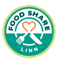
FOOD SHARE LINN
Under the umbrella of Linn County Public Health, Food Share Linn aims to connect organizations with excess food to community partners that feed the hungry. The shape of the logo we created represents a plate, tying back to the program's key donors, which include catering and event companies. The circular shape is also a nod to community and partnering local organizations. Varying shades of green are used to indicate sustainability, freshness and energy.
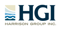
HGI - HARRISON GROUP INC.
Harrison Group Inc. is a new name for an existing business that wanted to reinforce the security and the stability of its new brand. For the new logo, we selected a color palette of mature blues and tans to exemplify a steadfast organization. The classically shaped serif font on “HGI” was chosen to reinforce this. The water in lakes and oceans are a source of inspiration and rejuvenation for the HGI family, hence the logo’s rectangular icon, which shows waves of simpler shapes reaching to the sky. This depicts HGI’s experience in their five key areas moving upward to reach their clients' goals.
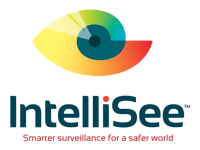
INTELLISEE
IntelliSee—a new company that uses advanced artificial intelligence to detect weapons and other threats to human safety—came to de Novo to name and brand their business. To combine the two elements of “Intelligence” and “Sight,” a stylized version of the Golden Ratio was used to shape the eye of the icon. The Golden Ratio shape touches on the intelligence of their product without imparting a cold, overly-technological feel. The wide open shape of the eye and the red dot on top of the “i” are direct references to their software being "always on, always seeing."
The color gradient from red to yellow to green to blue represents the many uses for IntelliSee, from detecting weapons to spill and fall risks, intruders and more. Darker green-blue colors were chosen to represent safety and security while contrasting the bright color gradient.
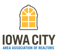
IOWA CITY AREA ASSOCIATION OF REALTORS (ICAAR)
ICAAR came to de Novo looking to revamp their dated logotype. To create a visual tie to the Iowa City area, we chose this crisp, architectural style window to exemplify the progressive community, while making a subtle nod to the cupola that sits atop the Old Capital building. The golden yellow was chosen to reinforce the gold dome of the cupola and promote an engaged, energetic organization.
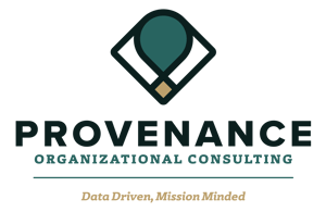
PROVENANCE ORGANIZATIONAL CONSULTING
This museum consulting firm selected de Novo to name and brand their organization. The definition of the word provenance as “the place of origin” was the main source of inspiration for the logo design. The “P” in “Provenance” is turned at a slight angle and then mirrored to create a symmetrical icon, which also intersects to form a visual point of origin. A dark shade of green was chosen as a primary color for its ties to growth and reliability, while gold is associated with wisdom and loyalty. A bold, sans serif font (used for the word “Provenance”) in combination with the slab serif font in the sub-head and tagline give the logo a serious, yet modern and creative tone.
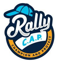
RALLY C.A.P. (CHAMPION AND PROTECT)
A local initiative in partnership with the Cedar Rapids Metro Economic Alliance, Rally C.A.P. was developed to support local businesses, arts and cultural attractions to help revitalize the economy in light of the pandemic. Based on the baseball superstition of wearing a baseball cap to will a team to victory, this same team mentality was the focus of this program. The baseball cap icon was used in the design to allude to the history of the term “rally cap” and also as a reference to the physical cap that participants could earn by making purchases at local businesses.
The hand lettering of the word “Rally” further emphasizes the team part of this initiative by mimicking a similar script style adopted by numerous athletic teams, which offers a playful, yet approachable quality. For the color palette, multiple shades of blue were chosen for their connection to inspiring loyalty, while the orange reflects a sense of encouragement and optimism.
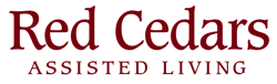
RED CEDARS ASSISTED LIVING
Cottage Grove Place worked with de Novo to name and brand their new assisted living service. Since the new identity was a sub brand and needed to graphically tie to the current Cottage Grove Place brand, we kept the color palette and added a dark brick red to complement their current colors. Keeping the same font as the Cottage Grove Place logo, we continued to build a connection to the Cottage Grove Place brand.
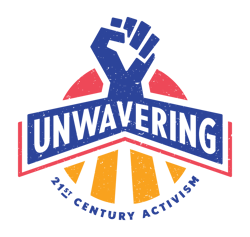
UNWAVERING: 21ST CENTURY ACTIVISM
Partnering with the African American Museum of Iowa, we created a logo for their newest exhibit, which focuses on contemporary and social movements like Black Lives Matter and #MeToo. The clenched fist is the focal point of the design and a visual link to activism, unity and solidarity, while the radiating lines along the bottom are a symbol of speaking out and spreading a message.
Bold, sans serif fonts used in the logo are representative of those often found in protest and political posters, while the color palette reflects power, pride and energy. Texture was applied to the overall design to give it a handcrafted appearance, further emphasizing the authenticity of the various movements depicted in the exhibit.
Are you in the beginning stages of branding your company and need a partner to walk you through the process?
Thinking about updating your logos, color palette or brand in general?
We can help!
Get in touch with de Novo and give us the low-down on your challenges.

Submit a Comment